Sunday, 20 September 2009
Thursday, 25 June 2009
Summer Homework
Deadline: Week Beginning 15/09/09
Semiotically analyse:
-one short film,
-one music video and...
-one five-minute segment from a documentary.
This analysis should be at least 750 words long per section and should include:
-Specific media studies and semiotic terminology,
-Media theory,
-Narrative analysis (where appropriate),
-Analysis of the media language used in terms of technical aspects of Camera shots, Angle, Movement and Composition, Editing, Sound, Music, Mise-en-Scène, Special Effects, and On-Screen Graphics.
-Analysis of mode of address, who is the target audience and how are they addressed by the text?
-An analysis of the representations included in the text
-An analysis of generic codes and conventions.
Wednesday, 24 June 2009
Lesson Objective
Assessment Objective
This Evaluation task fulfils Assessment Objective 2: Apply knowledge and understanding to show how meanings are created when analysing media products and evaluating your own practical work.
Today I will evaluate my video in a powerpoint presentation.
This Evaluation task fulfils Assessment Objective 2: Apply knowledge and understanding to show how meanings are created when analysing media products and evaluating your own practical work.
Today I will evaluate my video in a powerpoint presentation.
Monday, 22 June 2009
Lesson Objective
This lesson I have fufilled my lesson objective, by editing my footage and also uploaded the short film onto my blog. Next lesson I will evaluate this.
Lesson Objective
I have completed my lesson objective for today, so I will now upload the short video onto my blog and evaluate it.
Lesson Objective
My lesson objective for today is to edit the footage I shot last week in order to fulfil Assessment Objective 3.
Wednesday, 17 June 2009
Screenplay
Version 1
16/06/09
Group Number 1
John Booth (3132), Haley Tranfield(4034), Rebecca Martin
(3688) , Stacey Duty (3312)
Block Number
Int. Corridor - Day
Mary is seen walking down a corridor, before their purse
drops our of their pocket. Alex, shocked, sees the purse
and goes to pick it up. Alex follows Mary, calling out.
Alex: Hey! You dropped your wallet.
Mary: Oh, thanks. I didn’t notice.
Alex: Don’t thank me, its what I do.
Alex and Mary exit.
Fin.


Introduction to Unit G324: Advanced Portfolio- Video Task Shot List
1. Describe what you will need to show in order to tell this story. Make a detailed list of the shot types and editing techniques you will need to use.
2. Why are you using each of these techniques and what meaning will they produce for the viewer?
2. Why are you using each of these techniques and what meaning will they produce for the viewer?
Tuesday, 16 June 2009
Video Task
- Establishing shot of the corridor to set the scene
- Medium shot of person A as they will be dropping the item
- Insert shot of the purse that they have just dropped
- Close up of person B as they see the purse being dropped
- Insert shot of the purse on the floor
- Reaction shot of person B
- Shot stays on person B as they go to pick the purse up, this will pan across as they walk
- Insert shot of purse, showing the hand grabbing it
- Over the shoulder shot of person B giving person A the purse
- Master shot showing them both, person A thanking person B
- Same shot showing them leaving
Stacey, Haley, John and Rebecca
Monday, 15 June 2009
Introduction to Unit G324: Advanced Portfolio- Lesson Objectives
1. Complete a screenplay for my introduction to Unit G324: Advanced Portfolio Video Task.
2. Complete a storyboard for my introduction to Unit G324: Advanced Portfolio Video Task.
2. Complete a storyboard for my introduction to Unit G324: Advanced Portfolio Video Task.
Introduction to Unit G324: Advanced Portfolio- Assessment Objectives
The purpose of this unit is firstly to assess your ability to plan and construct media products using appropriate technical and creative skills (AO3); secondly to assess your ability to apply knowledge and understanding in evaluating your own work, showing how meanings and responses are created (AO2); and finally to assess your ability to undertake, apply and present appropriate research (AO4).
The unit requires you to engage with contemporary media technologies, giving you the opportunity to develop your own skills in these technologies. It also enables you to develop the skills of presentation that are required for further study at higher levels and in the workplace.
The unit requires you to engage with contemporary media technologies, giving you the opportunity to develop your own skills in these technologies. It also enables you to develop the skills of presentation that are required for further study at higher levels and in the workplace.
Friday, 8 May 2009

Thursday, 7 May 2009
APPENDICES
This is a list of the work we have had to produce in the process of making our music magazine:
APPENDIX 1 - RESEARCH INTO SIMILAR MEDIA PRODUCTS
You are required to investigate similar Media products as part of your initial planning. After your initial input into the codes and conventions of a magazine during class time this is your task: Semiotically analyse a music magazine.
APPENDICES 2 AND 3 – PRELIMINARY TASK
For the first part of your practical task, you have to create:1. front cover of a college magazine (use trc as the college) featuring masthead and a medium close up shot of a student and appropriate cover lines.
2. a mock up of the layout of the contents page of the magazine.
APPENDIX 4 – MAGAZINE INDUSTRY RESEARCH
Bauer and IPC Media
APPENDIX 5 – 3 IDEAS FOR A MAGAZINE
Under the headings:
Target Audience
Sub Genre
Title of Magazine and connotations
Ideas for main cover image
Ideas for main splash article
Ideas for other possible contents
APPENDIX 6 – FEEDBACK AND TUTOR FEEDBACK
Feedback from tutor and at least 3 other people. Analyse this feedback.
APPENDIX 7 – DESIGN PLANS
Rough drafts of your front cover, contents page and double page spread.
APPENDIX 8 - PRODUCTION SCHEDULE AND TREATMENT
EVALUATION
Wednesday, 6 May 2009
Photo examples


These are some examples of practise images I took for my front cover. I edited them on Photoshop by enhancing the colour and cropping them. However I will not use any of these for my front cover image as they didn't look right as medium close ups.
Evaluation
1. In what ways does your product use, develop or challenge forms and conventions of real media products?
For my media product, which is a music magazine, I have researched various other real magazines, looking at the different forms and conventions that are used to make it appeal to its target audience. From this research I found that the typical generic elements of a music magazine are a masthead, a lead, sell lines, banners, drop capitals, strap-lines, by-lines, fonts, house style and a mode of address. These all contribute in helping sell the magazine. I therefore used these generic elements in my magazine, to make it look realistic and professional. I was influenced mainly by Blender as I used a similar house style, as it is feminine so appeals to my target audience, and also used similar font sizes and styles as I think they worked well. I also looked at Mixmag, as this is a dance/pop magazine, which is the sub genre for mine. I imitated the masthead used on Mixmag, using a similar font and style. I have kept my magazine A4 size, as this is the general size used for most other music magazines I looked at. I looked at NME as I know this is a successful and popular magazine, and was inspired by the types of banners and articles used. Consequently, I used a similar banner on the front cover of my magazine, and also a similar layout for my double page spread, with images on the left hand side of the page and an article and interview on the next, with pull quotes in between.
2. How does your media product represent particular social groups?
My music magazine has a dance/pop sub genre, and is aimed at females aged between 14 and 25. The mise en scene of my magazine signifies my target audience as I have used feminine colours and type of house style which will appeal to them. I have also used images which will portray an ideal self, for girls. Some of these images are stereotypical as they show women in a glamorous way, which we often consider women to be. However the double page spread images are less stereotypical as they show a girl looking ambitious and talented, letting herself go and belting out on the microphone, which we wouldn’t normally associate with females. Representations of generic elements found on music magazines give connotations and meanings which help signify the magazine from others and grab the reader’s attention, making them want to buy the product. My images and articles used represent women artists positively in a fun and ambitious way, which will appeal to teenage girls and young women.
3. What kind of media institution might distribute your media product and why?
I would expect my magazine to be distributed by a large company such as IPC Media or Bauer. I would expect the circulation figure for my music magazine would be quite small in comparison with the readership, due to my target audience. I have aimed my magazine at teenagers and young people, who tend to pass magazines onto their friends, as they don’t usually have a lot of money themselves. This means that although I think the readership for my magazine will be high, the circulation will be quite low, as not as many teenagers will buy it as they will read it.
4. Who would be the audience for your media product?
Looking at the NME reader profile, there are some comparisons to my music magazine, which helps me understand who would be the typical reader of my magazine. The average age of people reading NME is 24, which would fit my target audience and the circulation figure of 56, 284 is much lower than the total readership of 369, 000. This reflects the target audience of the magazine and tells me that my magazine would have similar sort of figures. The reader profile also shows that 96% of the readers use the internet also the majority care about the appearance. I think an imaginary reader of my magazine would be a teenage girl around 17 years old as my magazine is very feminine. She would be working class- middle class and most probably be white, as the majority of the artists I include and people in my images are white. They would be quite sociable and outgoing, with interests including music, clubbing, dancing and generally going out with their friends.
5. How did you attract/address your audience?
I have used various elements in the front cover, contents page and double page spread of my music magazine to attract and address my target audience. This includes a feminine house style of purple, white and black colours and articles such as ‘Pop princesses stick together’ and ‘Queen of pop’ which will interest young girls. I have used an image of a glamorous girl, appearing to be having fun, on the front cover, which will act as an ideal self to girls as they can aspire to her. In the double page spread I have used 3 images of a girl with a microphone to symbolise music, which is appropriate for this style of magazine and it will also appeal to my audience. My text incorporates recognisable elements from Mixmag magazine, such as a similar masthead and use of fonts and house style. I have used a peer to peer mode of address, to suit my target audience which is teenagers and young adults. I have done this by using chatty text in my front cover, contents and double page spread, for example ‘party with’ and ‘hot new tracks’ which you would imagine friends saying to each other. This helps attract my audience as they feel more involved and part of the action. I have also used nicknames for some of the artists for a similar effect, such as ‘Britney’ which allows the audience to relate to her, as if they know her themselves.
6. What have you learnt about technologies from the process of constructing this media product?
During the process of constructing my media product, I learnt many new skills and about technologies. For the making of my front cover I learnt how to use Photoshop elements 5, which has allowed me to produce a masthead, make a banner, and use different types of text and font styles. I also learnt how to use photographic manipulation in enhancing and editing my photos, then crop and cut them out, to re arrange them where I wanted on the page. I have used the following tools to do so:
· Magnetic Lasso Tool
· Crop Tool
· Paint Bucket Tool
· Horizontal Type Tool
· Eraser Tool
· Rectangular Marquee Tool
· Move Tool
· Brush Tool
· Enhance- Adjust lighting, Brightness and contrast
There were many strengths in using Photoshop elements, as it allowed me to create the layout I wanted, and edit my images and text; however its weakness was the cutting out stage of the images. I found it difficult at times using the Magnetic Lasso Tool, as it is free-hand and so required a lot of time and patience.
For the contents and double page spread of my magazine, I learnt how to use quark express. From this I was able to produce columns for my text, articles and interviews and import images. It allowed me to use various font styles and colours and also produce the layout I wanted. However Quark doesn’t have any cropping, enhancing, or brush tools, and so prevents you from making a masthead or editing images, which made it difficult.
Through the process of using a blog, I have learnt how to upload new posts, edit and customise them, and keep a schedule of my work whilst doing so. Although there were some problems with uploading some of the images and drafts that were produced on Photoshop and Quark, however I overcame this by going to File > Export > Layout as PDF then saving it in my Z:Drive as a pdf image in Quark. I then uploaded the image onto Photoshop and saved it as a psd document. For Photoshop, I saved my file as a GIF image, which allowed me to upload it onto my blog.
During the photography stage of my media product, I was taught how to correctly use a digital SLR camera, with lighting and a backdrop, which enabled me to produce professional looking photo’s to use on the front cover, contents page and double page spread of my magazine.
Sunday, 3 May 2009
Practise images


I took several photographs of my friend above and edited them using photoshop. I was originally going to use them for my main front cover image, however I decided against this as I thought they looked too plain and simple. Therefore I took more photo's of my friend wearing different clothes in different positions to get a better result.
Friday, 1 May 2009
My article/interview
Sheridan Leonie has stormed the nation, her number one on both sides of the Atlantic with her single Diva.
So far she's the most successful of our Spanking New For 09 nominees having also written for other massive artists and is also said to win many other awards.
We talked to the 19 year old exclusively, to hear how she found fame at the top!
SERENE: How does it feel to be number one in the UK and the US?
SHERIDAN LEONIE: It feels amazing- it feels even better because we worked really hard. I wrote Diversity exactly a year ago. It was hard work and a lot of people didn’t believe in it at first. I’ll be glad to get back home to London- I’m gonna show everyone in the UK what I’m made of.
Is it important for you to be successful in the US?
As somebody who has been obsessed with Madonna and Cher it definitely is. The US has a very specific way it receives pop music. It means a bit more to be accepted there, because it’s such a big and dominating place, with some of the most successful artists around!
Are you planning on going on tour all over the country?
I’m touring with Pink in November, which I’m really looking forward to. Pink’s so great! It’s crazy that my first tour is in arena's and is so huge. I just want to perform for my fans at the shows and make them happy, doing what I love.
Tell us a bit about your album?
I just feel like this record is really different- you’ve got a mixture of everything from club bangers to more 70s glam to pop/dance music. What I really love about the music is that I’m not the first pop artist to come around, but I put my own twist and interpretation on it! Diversity is not about who you are- it’s about how everybody wants to know who you are!
When was it recorded?
I’ve been writing Diversity for 2 years. I wrote half of the album in one week last January. I think you’ve really got to allow artists creativity to marinate. It took me a while but really delving into myself I finally got it. I couldn’t be more proud of it. It’s not just a record it’s a whole pop art movement, it’s not just about one song.
So what’s your favourite song on the album then?
I love them all! They’re all so different and I’ve enjoyed writing and recording them all! I think it would have to be Superstar though, because it’s really edgy and basically tells the story of how I got where I am today!
If you could choose anyone to record with, who would it be?
Erm.. Theres so many. I’d love to record with Beyonce, she’s really inspirational and her songs are great. Or Justin Timberlake, I’ve always liked his style. I really like Lady Gaga too, she’s amazing.
What’s a typical day for you when you’re not out recording songs or performing?
I’m just you’re typical girl really. I love my all family and friends, so I try and spend as much time with them as I can, they help me stay grounded. I think that’s really important when you’re in an industry like this. I love just hanging out, clubbing, going to the cinema and shopping of course. Nights in with a film and chocolate are always good too.
So you still like your chocolate? How do you manage to keep your figure?
Yeah! I couldn’t last without chocolate, it keeps me sane! I just try and watch what I’m eating and go to the gym as much as I can. The dancing for videos and tours are a big help too!
And is there a man on the scene?
No, at the moment I’m a single lady. Boy’s are always fun and I have a lot of close male friends, but I’m married to my music.
Finally, why should we seek out Sheridan Leonie?
That’s a hard question. I think my music brings back fun and quirkiness into pop. It has a variety from electro-pop to dance/pop and shows originality and creativity!
Monday, 27 April 2009
Lady Gaga Image

I researched various images, using the internet, to find an image that would be suitable to replicate for my magazine. I found this picture of Lady Gaga, which I think would look good as a front cover image, as it is edgy, yet still represents pop/dance music, which is the sub genre of my magazine. Therefore I will take photographs of someone in a similar pose to this, to get the same effect.
Thursday, 23 April 2009
Examples Of Interview Questions
1. What type of band are you?
2. Tell us the brief history of your band.
3. Who are your musical and non-musical influences?
4. What are your dreams and goals?
5. Who writes the songs, what are they about?
6. How do you promote your band and shows?
7. What do you think about downloading music online?
8. What's your outlook on the record industry today?
9. What's your claim to fame?
10. Tell us a story about a day in your life.
11. What inspires you to do what you do?
12. What advice would you give to fellow bands?
13. What are some of your pet peeves?
14. How does music affect you and the world around you?
15. What's new in the recording of your music?
16. What are the biggest obstacles for bands?
17. What's the best and worst thing about playing clubs?
18. Tell us about your next shows and why we should be there.
Wednesday, 22 April 2009
Examples Of Articles
Q Magazine
Lily Allen- April 2009
"My boobs keep falling out!" Two and a half years after her debut Alright, Still Lily Allen's free-spirited attitude remains fully intact. Q spends a whirlwind press-day with Lily dodging paparazzi and talking older men, lap dancers and of course, Barack Obama.
The Killers- March 2009
Three albums in and the band are at the top of their game. Q cruises round Las Vegas with the band talking Zen, Mormonism and, ahem, Dire Straits. Then thrashing the living daylights out of a Cadillac in the Nevada desert.
Exanple Of An Interview
Katy Perry interview- Published on February 6, 2008
What’s been going on lately?
I’m just starting the New Year, you know. The stars are aligning for Katy Perry in 2008. I’ve been working on my record since I was eighteen years old. I’ve gone through two record labels and written between sixty-five and seventy songs, and now it’s ready to come out. It’s been a long trip. I’ve had lots of money, lost lots of money, but the record’s here and it’s the right one.
What can we expect from the album?
UR So Gay was a soft hello. It wasn’t meant to be a big single or show what the album is going to be all about. That was for my Internet bloggers, so I’m not coming out of nowhere. UR So Gay was meant to be an introduction and a background. The album will have a lot of the same characteristics, though. There will be lots of storytelling, because lyrics are important to me. There are a few songs that will make you cry, but there are others to make you dance and sing. Every song is on the album for a specific reason.
What do most people not know about recording an album?
One of the unique things about me recording is that I like to put down the vocal track with all the lights off in the studio. If I remember the lyrics, I don’t want anything to get in the way.I want to be a voice in the darkness. That’s not weird is it? It’s not like I’m naked or anything.
Do you prefer to be recording or playing live?
I guess I prefer to play live, but I don’t want to have only live CDs. I like playing live because there are alot of things that can happen. I can interact with the audience and say some things to get me in trouble. On the other hand, the studio is nice because you can really take your time and make something that you know is the best thing that you can ever do. But nothing beats being up on stage in front of all that energy.
Give me an awesome tour story, then.
There was the Silly String incident. I was playing a concert and I decided that I wanted a beach theme. No particular reason, I’m just fun like that. The band entered to “Wipe Out” and everybody was wearing their bathing suits. I should mention at this point that we were doing this show for Garnier Fructis hair-care products, and they’ve spent like an hour and a half getting my hair just right. So I’m out there in my bathing suit with my awesome hair and I have some Silly String. I don’t know why I have the silly string, of course. It’s just kind of fun. So I point it at the audience and try to spray them. Only instead of spraying it at the audience I had thecan backward and sprayed it all over my awesome hair. Everybody thought that was pretty funny. Except maybe the hair people, I guess.
Do you have conscious influences? Do you ever say like, ‘I’m going to try to write a song that sounds like Prince today?
Yeah. I’m a huge fan of Freddie Mercury. I’m a fan of lots of music, but he was a turning point. I wasn’t allowed to listen to secular music when I was kid, but there was a time when I was hanging out at my friend’s house. We’re trying on all our outfits, like girls do, and out of nowhere I heard the lyrics to “Killer Queen.” Time stood still. The music was totally different from anything I’d heard. I still love Freddie Mercury. He was flamboyant with atwist of the operatic, but more importantly he just didn’t give a fuck.And then there was Alanis Morrisette. Jagged Little Pill was huge for me. One of the vivid memories of my childhood is swinging on the swing set singing "Ironic" at the top of my lungs. I went to Christian school, so I got into a little trouble for that one.
How did you come across “Use Your Love”?
There were a couple of choices in the pile for covers. I actually wanted to do a Queen cover, but there wasn’t anything they would play in the club. So I’m back to square one, and I go out dancing with my girls. “Use Your Love,” the original version by the Outfield, comes on, and immediately every girl hits the dance floor. Everybody’s out there dancing and trying to hit these notes. It was the best time, and I wanted to capture that on the UR So Gay.
Do you think that UR So Gay enforces a negative stereotype?
Every time I play that song, everybody has come back laughing. I’m not the type of person who walks around calling everything gay. That song is about a specific guy that I used to date and specific issues that he had. The song is about my ex wearing guyliner and taking emo pictures of himself in the bathroom mirror. The listeners have to read the context of the song and decide for themselves.
Why should people seek out Katy Perry?
That’s a hard question. Nobody likes to brag. If you’re forcing me, though, I think people should check out my music it’s fun and funny, and I actually sing them live. I think that my music makes pop-music cool again.
Double Page Spread- Draft


This is the draft for the double page spread of my magazine. I researched various music magazines, using the influence of NME and Kerrang magazine to create my draft. I looked at the generic elements of their double page spreads, including the type of layout, images, sell lines, lead, drop capitals, banners and house style, which I have continued throughout my magazine.
Contents Page- Draft

I have produced this draft of my contents page for my music magazine by looking at real magazines for ideas about the type of layout, house style and images I should use. I have kept a white background to follow the theme of my front cover. I will take photographs similar to the ones I have used here, to get the same effect.
Tuesday, 21 April 2009
Front Cover- Draft

This is the front cover draft for my music magazine. I have used several magazines, including mixmag and mainly blender for inspiration and ideas about the generic elements of a music magazine, such as the type of masthead, fonts, mode of address, sell lines, banners and house style. I have kept a house style of using only purple and black against a white background, and used the same font throughout which is 'myriad condensed web' to keep it looking professional.
Sunday, 19 April 2009
Treatment
SERENE
Stacey Duty, Sheridan Ward, Alisha Flintham, Nicola Scally, Deanne Wright
I am creating a front cover, contents page and double page spread of a music magazine based on the sub genre Pop/Dance, using inspiration such as masthead, layout, house style, articles and images, from real music magazines which have a similar sub genre to mine.
My magazine will be aimed at teenagers and young adults, aged from 14-25. It will be aimed at girls as it will include some features that are feminine such as feminine colours and type of house style. The magazine will have a niche target audience as the sub genre is specific, so will only appeal to people who enjoy that type of music.
As my magazine will be a Pop/Dance music magazine, the photo’s I take will look energetic and fun and will represent music in this way. For the front cover image, I will take a medium close up of a friend turning her head to the camera and laughing as if she is having a good time. She will be wearing a bright coloured top with her hair down and straight, to give an energetic and vibrant look. This image will portray an ideal self, for the target audience of which is girls. For the contents page, I will take a photograph of a group of girls who are in a band. They will be at one of their gigs, dressed up, with their hair and make up done, wearing party clothing and looking glamorous. I will also take a photograph of a dancefloor inside a club, which will signify a kind of rave. For the double page spread I will take 3 separate photographs of a friend, which will replicate images of Kelly Clarkson that I found. She will be wearing black leggings, a plain white top and black jacket, as this will give a modern and dance- style look and also this worked well for the photos of Kelly Clarkson. She will be holding a microphone in all of the shots to symbolise that she is a music artist. They will both be action looking shots, which will portray my Pop/Dance music sub genre.
I will interview my friend, for my main article, asking questions about her new success in music, with her new album etc, and how her lifestyle has changed. However this will not be real and she will make the answers up as she is not a real singer. For ideas on how to present the interview and rest of the article, I research different music magazines, looking at the double page spread, including the choice of layout and style, for inspiration on how to create mine.
To keep the photo shoot’s safe, ensuring there won’t be any possible health and safety risks, I will take the front cover and double page spread photos in the media room M236, where there will be a blank backdrop and required equipment such as the lights and cameras. Incase of anything going wrong, the nearest First Aider is Vicky Rowntree in M138 or one of the Sports Staff in SD3 or in the event of a fire, the evacuation assembly point in the event of fire or other emergency is the Front Football Pitch.
5 Rules Of Photography
1. No cluttered backgrounds (as this can make it look to busy and will put readers off as it will be difficult to read)
2. Make sure you focus on the lead singer if it is a band shot so the audience KNOW who they are!
• If it is a single artist make sure it is a medium shot – close up.
•A ¾ image may be good, not centred.
3. Leave room for a masthead. (Make sure it is clear to read and nothing is covering parts of it, such as the main image)
4. No high angle shots – they make bad cover images! Fine for double page spread but really poor on covers.
5. Animate your band – make sure they look at the camera! (This appeals to the reader and grabs their attention)
Photo Examples


I researched different images that are used on real music magazines, to give me ideas on what type of photographs to take for my magazine. As the sub genre for my magazine is Pop/Dance, the photo's I take should reflect this, and look energetic and fun, whilst obviously representing music. I found these images of Kelly Clarkson which I think are ideal examples to use for my magazine as they are action shots, which ties in with my sub genre well. They also look modern, which is perfect for my target audience. She looks like a successful artist, which would help my magazine look more realistic and professional, whilst also fitting in with the main article that will be on the double page spread of my magazine. I will therefore focus on these images when taking my own photographs to use for my magazine.
Magazine Research- Double Page Spread


I have researched different double page spreads of real music magazines of a similar sub genre to the one I will use for my magazine, to give me an idea of what type of house styles, layouts, sell-lines, articles and images are used. I really like the layout of the first magazine as it is simple and modern looking, using a plain white background and black writing in contrast. I like the font style of the title and how it is big and bold, to make it stand out. There is a short introductory paragraph of the article below, in bold writing, which I think works well as it gives the reader an insight of what the article will be about. I will therefore use a similar layout for the double page spread of my magazine. Although I like the image next to the article as it is edgy and unique and also contemporary looking, I will use smaller images on my double page spread, but in a similar way. I like the way the second magazine is set out like an interview, in 3 columns, with questions in bold writing to stand out, and answers below. I also like the sell-line in the middle of the text as it makes the page look more exciting and will appeal to reader’s, making them want to read the article. I will create my article in a similar sort of way, as I think this works well. I like the layout of the next magazine, with a large image of a band on one side of the page and the article on the next, as I think this looks effective and states the importance of the band. The bold title and sell-line are eye catching and striking, which encourages me to create the double page spread of my magazine in a similar style.
Magazine Research- Contents page


To give me ideas of the generic elements used in contents pages of real music magazines, I researched several different magazines. I found a variety, which were all different from each other in the types of Mastheads, house styles, font styles and layouts used. I chose these 3 contents pages from the magazines Q and NME, which are both mainstream so could be used for my magazine. They all have similar layouts, which each look eye catching and exciting, yet reader friendly. I like the simplicity of the middle and right hand side magazines as they are easy to follow in the way they are set out with bold headings, sell- lines, page numbers and separate columns. They each have a large image of a band or artist, with a short preview article below, which is there to grab the reader’s attention and make them want to read on. I will set out my contents page in a similar way as I think this works well and would be successful for my magazine. I like the bright colours of the left hand side magazine as they are vibrant and feminine, which is ideal for my target audience and fits the Pop/Dance sub genre that my magazine will be based around. I will therefore use similar colours for my contents page.
Magazine Research- Front Cover


I researched a variety of different music magazines, with a similar sub genre to the Pop/Dance sub genre of my magazine, to give me ideas and inspiration on the masthead, house style, font styles, banners, articles and strap-lines used in real music magazines. I found these 2 magazines which I think all suit the type of magazine I am doing, and I could use as guides when creating my magazine, to help me achieve a professional look. I like the layout and house style of the ‘blender’ magazine as it is simple, yet effective. The colours used are feminine, yet could still be aimed at a male audience, which is ideal for my target audience. The different sized fonts give it an edgy, yet exciting look, which would grab the reader’s attention. It also gives it an energetic feel, which ties in with my Pop/Dance genre. I will therefore create my magazine in a similar way. The Masthead of the ‘mixmag’ magazine is bold and looks as if it is aimed at teenagers, as it is modern and fun looking, which is the effect I want to achieve from my magazine. I will make my Masthead to look like this one as I think this works well.
Chosen Font
Looking at the 3 different types of the 'Sansation font', I like the bold one the most. I think the font suits my Pop/Dance genre as it is rounded and bubble like, which will also make it stand out as a Masthead, to help catch the reader's eye. I will therefore use a similar font for the Masthead and main writing on my magazine, as I think this will work well.


Analysis Of Fonts
I researched a variety of fonts to give me ideas of the fonts I could potentially use for the Masthead of my magazine and other writing on the cover, contents and double page spread. I looked on the website dafont.com and found several fonts which I liked and thought suited the genre of my music magazine and target audience. Although the 'Starguides' and 'New facebook' fonts are both exciting and unique, I think that they are too fussy to use for the masthead and writing and they would make the magazine too cluttered and busy to look at. I really liked both the 'Cheri' fonts, but I think they are too feminine which would limit my target audience, as it could put off some males. I think both the 'Rounded' and 'Geo Sans Light' font are modern looking, which would suit my target audience as they will be young, however I dont think they would stand out enough to grab the readers attention. The font I like the most is the 'Sansation' font as it is simple, yet modern. However I dont know whether the light, regular or bold version of the font would be best. I will therefore enter my 'Serene' title in each of the fonts to give me a better idea of which would be most successful.


Analysis Of Feedback
After posting my 3 possible ideas for my music magazine, I asked a few people, including my teacher for feedback on my ideas, to look at them and comment on which they liked the best or the least. I did this to give me more than one perspective, to help me decide which would be the most successful idea to use for my final magazine. The comments I recieved were positive overall. The idea which seemed most popular was the Pop/Dance genre music magazine idea, however most people liked the name 'Serene' to use as the title. Therefore I will create my music magazine, based around my 2nd idea. The target audience for my magazine will be teenagers- young adults, aged from 14-25. The magazine will be aimed at girls, and a niche audience as the sub genre of the magazine will be Pop/Dance. The title of the magazine will be 'Serene' and the main image on the front cover will be a medium close up of a glamorous girl that appears to be smiling or laughing and having fun, which will represent the sub genre and target audience. The main article for the magazine will include the girl on the front cover, being 'revealed', and will be based around her new success in music and her lifestyle, as this signifies an ideal self for girls. Other articles and ideas for other contents will include tour dates, free giveaways, and a range of artists and bands to interest the readers.
Glossary Of Magazine Terms
Masthead – The name and logo of the magazine.
The Lead – the introductory paragraph of an article. Usually written in bold or capitals. Body copy refers to the text of your written articles, which should be produced as a printed presentation to accepted industry standards, e.g. correct use of language, font size, word limits etc. Usually written in columns.
Serif font – fonts like Times New Roman, or Baskerville Old Face, which have little bars (serifs) on the end of the letters.
Sans serif font – fonts like Impact, or Agency FB, which do not have little bars (serifs) on the end of the letters.
Drop Capitals – Really big letter, which start off an article.
Cross Head – Small sub-heading used to split up a large block of text.
White Space – white parts of a page other than text or pictures.
Mode Of Address – How the magazine talks to the audience.
Sell Lines – Text on the cover that helps to sell the magazine to the audience. Kerrang!’s sell line is “life is loud”.
Banners – text, which stands out because its on a coloured background.
House Style – a magazines distinctive design that distinguishes it from its competitors.
Borders – the gaps at the edges of the page.
Gutters – the gaps between the columns of text.
Leading - the space between lines of text.
Kerning - the space between letters.
Strap Lines – a smaller headline, printed above the main headline.
By-lines - name of the person who wrote the article.
Picture Credits - where did the photos come from, or who took them.
Anchorage – The way in which text helps to pin down the meaning of a picture and visa versa.
Thursday, 26 March 2009
Replicating front cover images


 As practise for when we take our own photographs for our front cover, contents page and double page spread, we used real celebrity photgraphs to replicate the images. In a group of 5, we each had our turn of posing for the photo and taking the photo itself. This gave us the opportunity to develop our skills of photography, in communicating with the models and positioning them to achieve the right shot, which will help when taking the real photos for our magazine.
 Thursday, 12 March 2009
Bauer & IPC Media Analysis
The two main companies that dominate the UK magazine market are Bauer and IPC Media, which are German multinational cross media companies. They each produce a wide variety of magazines, including music magazines. Bauer is an independent company, who owns the music magazines Mojo, Kerrang and Q. These all have different sub genres and therefore are all aimed at different audiences. Mojo and Kerrang are both aimed at niche audiences as they are aimed specifically at a certain age group or type of person. Mojo is a classic rock magazine, aimed mainly at adults with a playlist ranging from the 60’s to the 80’s. Kerrang is a magazine based around heavy metal, which is aimed at teenagers or young adults, for its controversial themes.
Whereas Q is a general magazine, produced monthly, which is aimed at a mainstream audience. Much of the magazine is devoted to interviews with popular musical artists.
IPC Media is part of the American Time Warner group conglomerate, owning the music magazines NME, Uncut and Guitar & Bass. Each of these are aimed at niche audiences. NME is a weekly, general contemporary music magazine for teenagers and young adults. Uncut is monthly magazine aimed mainly at adults. It celebrates rock music and film and often produces themed spin-off titles celebrating the career of one artist. Guitar & bass is a music magazine aimed specifically at serious guitarists as it includes guitar tests, playing techniques, an exclusive bass section and in-depth features on guitar heroes past, present and future.
Every magazine has their own individual demographic readership, which is the amount of people that read the magazine, and circulation figures, which is the total number of people who buy the magazine, both depending on how popular the magazine is. I will look at the following 3 magazines owned by Bauer, focusing on each of their demographic readerships and circulation figures, along with their target audience.
Kerrang has a total circulation figure of 52,272, however this does not reflect its demographic readership as this would be considerably higher. Mojo has a much higher circulation figure of 100,507, only 55,610 of which is from the UK and the Republic of Ireland, showing that the magazine is more internationally based and is more popular with other countries around the world. Q had the highest circulation figure with 103,017, which is mainly due to its target audience being adults who have the money to spend on magazines.
Each magazine has a demographic reader in mind, which is the target audience for that particular magazine.
Kerrang is aimed at teenagers and young adults aged 14-25. This is shown through their choice of main images and articles, involving rockstar icons, adverts and free posters and giveaways. Mojo is targeted at older people aged at 35 +, as has a sub genre of classic rock, which is stereotyped with adults. It also shows images on the front cover of bands from the 60’s, 70’s and 80’s such as The Beatles and Blondie. Q is aimed at a mainstream audience, from the age 18-45 as it is a general magazine. This is shown through the variety of artists and articles it portrays, such as Madonna, Kylie and Bob Dylan.
I will now look at the demographic readerships, circulation figures and target audiences of 3 different music magazines that are all owned by IPC Media.
Guitar & Bass has a small total circulation figure of only 6,771, showing it isn’t a particularly popular magazine. This is due to its niche audience, limiting the number of people that may be interested in it. Uncut has a much higher total circulation figure of 87,069, due to it been aimed mainly at adults, who have the money to buy magazines. NME has a total circulation figure of 48,459, which isn’t a true reflection of how many people like the magazine as it is targeted mainly at teenagers and young adults who tend to read their friends magazines that have been passed on, rather than buy them their selves.
Uncut has a mainstream audience but is aimed mainly at adults as it focuses on all that is great in rock and film, both new and old, cult and classic, which we associate with older people. This is portrayed through the variety of older artists and bands it shows, including U2 and Oasis. Guitar & Bass is aimed at a niche audience as it is specifically based on rock music. It is therefore targeted at older people, as this type of music is most associated with them, rather than teenagers or young adults. This is shown through the front cover images of mainly guitars and the related articles that feature rock type bands. NME is aimed at a mainstream audience, but mainly teenagers and young adults. It is a general magazine as it portrays a wide genre of music, including pop and indie. We can see this through the fashionable and groomed looking bands and artists on the front cover and also the free giveaways, posters and competitions, which would appeal to younger people.
Both the companies Bauer and IPC Media use the process of synergy, in which different type of media join together to help promote and sell their brands.
Kerrang magazine, owned by Bauer, uses various types of media which work together in advertising their product. For example Kerrang has its own music channel, radio station, album releases, festival, awards and tour, as well as their magazine. These all contribute in promoting Kerrang and therefore achieving more money for the company. Mojo, along with its own magazine, has its own music channel, produces its own album, and hosts various shows and tours and also Mojo music awards. These different types of media all work together in successfully promoting Mojo. Q magazine similarly uses different types of media, in the process of synergy, to help sell their brands. This includes their own music channel, music awards and music album ‘Q The Album 2008’, which was recently released.
Guitar & Bass, owned by IPC Media, uses different types of media to help promote their product, such as their own magazine and website. Uncut also has its own website, along with the magazine, which helps advertise and sell their product in a similar way. NME uses the process of synergy to promote their brand. Along with their magazine, they also have their own radio station, music awards, tours including the NME Radar Tour, mobile phone set up, and music channel, which all work together to help sell their product.
Tuesday, 10 March 2009
Magazine Ideas
Initial ideas for main product
Target audience: Age 18-25, Mixed gender, Niche audience
Sub genre: RnB
Title of magazine: Placid or Serene
Ideas for main image: Medium close up of a girl posing.
Ideas for main article: Talking about the ‘artist’s’ new success with her hit single.
Ideas for other contents: A list of rappers and other RnB artists, other stories, and top 10 albums.
Target audience: Age 14-25, Mixed gender but mainly girls, Niche audience
Sub genre: Pop/dance
Title of magazine: Fusion
Ideas for main image: Medium close up of a glamorous girl that looks as if she is laughing or dancing.
Ideas for main article: The ‘artist’ Exposed, talking about her lifestyle- Drama, men and success.
Ideas for other contents: Tours, banner at bottom saying free magazine inside, celebrating bands and artists, and some other stories.
Target audience: Aged 16-35, Mixed gender, Niche audience
Sub Genre: Indie
Title of magazine: Uncovered
Ideas for main image: A small group of 4 men, as if in a band, looking quirky.
Ideas for main article: New success- Britain’s biggest band
Ideas for other contents: Tour dates, a list of indie bands, ‘greatest indie anthems ever’ and a few other short articles.
Tuesday, 24 February 2009
Double spread page analysis

In this double page spread of the music magazine Kerrang! there is text written at the top left hand corner saying ‘Hell Hath No Fury…’ connoting the saying ‘hell hath no fury like a woman’s scorn’, which suggests that if men cheat on women they will be severely punished by the woman for doing so. This is appropriate for Kerrang! magazine as it is based around heavy metal music and is seen to be controversial and outspoken. It also raises the idea of challenging traditional stereotypes for the magazine as we would expect there to be an article about a man and not a woman, especially not one who is connoting violence and revenge. The word ‘Hell’ is bigger than the rest of the text, to make it stand out as it is significant in representing a harsh, fiery place in which you go if you have sinned. This relates to the target audience of the magazine, which are teenagers who like heavy metal music in particular, as it suggests a sense of danger, controversy and evil. The phrase is in bold black writing in an old fashioned italic style font to relate to the theme of sin and defying all good.
The main image is a medium close up of a woman clenching her fists and screaming out. She is looking up, as if she is screaming at god or the heavens, which juxtaposes with the word ‘Hell’.
She is wearing a black leather jacket that is zipped halfway down, to show her cleavage. This relates to fans of heavy metal music, as they are often seen to dress in dark colours and leather. It also connotes that she is promiscuous and seductive, appealing to a teenage male audience, who see her as an ideal partner, whilst influencing the female teenage audience as they aspire to her as she is attractive.
Below the ‘Hell hath no fury’ text, is the lead, which is the introductory paragraph of the article, beginning with ‘Arch enemy’s’. This suggests that this woman is controversial and outspoken, having enemy’s, which relates to the heavy metal genre of the magazine. It can also connote that she is independent, in being outspoken, which females can relate and look up to. The paragraph also says ‘fighting for survival in a male-dominated industry’, suggesting again that she is independent, whilst challenging traditional gender stereotypes and creating anchorage with the image. This can appeal to readers as it is out of the ordinary, and it is making a statement that many teenagers and young adults can relate to, especially females.
Below the opening paragraph is another detailed paragraph, which is in a smaller, serif font, as it is the main information on the page and so is clear and easy to read. It begins with the short phrase ‘The fact’ which is in bold capitals and is a larger font, to make it stand out as it is stating that the following text will be ‘Facts’. This creates a relationship with the reader as they are being told the truth and secrets of this rock star. On this double page spread, surrounding the image and text, there is a lot of white space, which makes it simple, yet effective in creating a modern look that is straight to the point. This is ideal for the theme the article is dealing with. It also continues the house style of the magazine, along with the bold black text.
Monday, 23 February 2009


Wednesday, 11 February 2009
Contents page research


To produce the contents page for my college magazine, I first researched various other magazine contents pages to give me ideas. I chose these 2 contents pages to look at as they are both simple yet effective. I like 'contents' masthead of the left one as it is unique and original which I think is essential for a magazine to be. This inspires me to create my masthead in the same way. I also like the layout with the contents list and masthead at the right hand side and picture on the left as it is looks more simple and modern. On the left magazine contents page, the list is set out clearly with titles and numbers in a bigger font the to rest of the list, making it easy to read. This gives me the idea of creating my contents list in a similar way.
Front cover research
 I Researched different magazine covers to give me ideas about the style and features that I could include in my college magazine. The masthead is bold and simple and is postitioned in the top left hand corner which is unique as most magazines have their masthead centred at the top. This encouraged me to put my 'TRC' masthead at the top left hand corner. I like the way the house style is simple, yet eye catching as it uses only a bold red, white and black for the colours and font that is easy to read and stands out, which inspires me to use my house style in a similar way. Also there is a circular shape at the right hand side of the magazine cover advertising 'The 50 best british albums' which draws people in. I will use a circular shape in a similar way for my magazine cover as I think this works well.
 Monday, 26 January 2009
Magazine front cover analysis

The Title of the magazine is Kerrang! which has connotations of an e chord on a guitar, relating to the heavy metal genre of the magazine. It also has an exclamation mark at the end to symbolise the statement it is making as heavy metal is a bold genre with a niche audience and also to connote a loud sound, as heavy metal is often listened to at a high volume. Kerrang! magazines are for teenagers who like heavy metal music, and are usually aimed at males, however this particular Kerrang! magazine inverts this by challenging stereotypical females, in having an attractive woman as the main image and using pink as the main theme of colour, as this is considered to be a girly colour and you wouldn’t expect females to be interested in heavy metal music.
The main image, presenting the cover story, is of a woman, which not only inverts the stereotypical male artists and male audience, by appealing to girls who would consider this woman to be an ideal self but also attracts males as they see her to be an ideal partner. The woman is blonde, which is stereotypical for models and is attractive and appears stylish, whilst wearing a leather jacket. This relates to characteristics of heavy metal band members and fans and appeals to teenagers as they can aspire to her.
Her facial expression shows a direct gaze looking straight at the reader to grab their attention. However she is wearing sunglasses to minimize what we can see of her, which makes her appear to be mysterious. Her expression also looks seductive, along with her body language, in which she is opening her jacket, revealing her bra. This makes her character seem sexy and promiscuous, appealing to male teenagers.
Underneath this image are phrases with various typefaces to show a difference in importance of the text, whilst looking attractive and following the house style of the magazine. ‘I’m not a bitch…’ is written in pink lowercase letters to show a softer side to this woman, which challenges the stereotypical view of heavy metal band members as being ‘bitches’. Below follows ‘ARCH ENEMY’ is capital white bold letters, to stand out and reinforce the characteristics of a band member as being rebellious and defiant, which appeals to teenagers as they are seen as rebellious, and so can relate to her. Underneath this writes ‘CONFESSIONS OF A METAL GODDESS’ in pink capitals to stand out, whilst tying in with the house style. This appeals to the readers as it is personal, making them feel as if they are a friend of hers and she is sharing her secrets with them. Also ‘metal goddess’ makes her seem the goddess of heavy metal music, exaggerating her importance, which causes readers to aspire to her.
In the top left corner there is an image of an artist playing live, within a white border, which is part of the house style. This has been done to show him in action, as if we are there watching him, which intrigues his fans and also draws in other people who are perhaps curious by him. There is bold pink text in capitals to stand out, saying ‘HIM’ which makes him seem important and superior, as if everyone knows who he is. Underneath there is black, smaller text in capitals saying ’24 HOUR IN LONDON WITH VILLE’ to inform readers what will be written about him inside and to also signify a wild sort of partying character as it seems like he is performing ’24 hours’.
At the bottom of the page is 2 images, both in white borders to again continue the house style, with a bold heading of ‘FREE POSTERS’ in white, highlighted in bright pink, to make it stand out, as it is advertising an offer that something is ‘free’, which appeals to readers. The images shows the ‘Foo Fighters’ and ‘Serj Tankian’ which have been chosen to appeal to their fans. Below is a white text in a pink highlighted band, to reiterate the house style. It is slightly diagonal, to give a quirky look, fitting in with the style of magazine. ‘PLUS!’ is written to exaggerate that there is even more inside the magazine, followed by a list of artists names, which is there to show the readers what will be inside but also to appeal to fans who perhaps don’t like the look of the main image or other bands, however would buy the magazine because their favourite artists are inside.
At the top of the magazine shows a similar list of artists, such as ‘Paramore’, to appeal to their fans and make them want to buy the magazine. Each different artists name has a pink star separating them to make it look attractive and fun. The overall mode of address used in this magazine cover is peer to peer, with phrases such as ’24 hours in London with Ville’ and ‘confessions of a metal goddess’ creating a personal friendship with the readers as they feel part of the action, making them want to read on.
Subscribe to:
Posts (Atom)
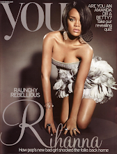
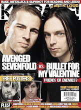
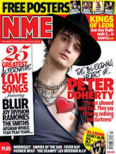
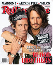
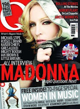
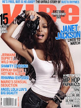