
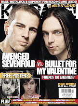
In this double page spread of the music magazine Kerrang! there is text written at the top left hand corner saying ‘Hell Hath No Fury…’ connoting the saying ‘hell hath no fury like a woman’s scorn’, which suggests that if men cheat on women they will be severely punished by the woman for doing so. This is appropriate for Kerrang! magazine as it is based around heavy metal music and is seen to be controversial and outspoken. It also raises the idea of challenging traditional stereotypes for the magazine as we would expect there to be an article about a man and not a woman, especially not one who is connoting violence and revenge. The word ‘Hell’ is bigger than the rest of the text, to make it stand out as it is significant in representing a harsh, fiery place in which you go if you have sinned. This relates to the target audience of the magazine, which are teenagers who like heavy metal music in particular, as it suggests a sense of danger, controversy and evil. The phrase is in bold black writing in an old fashioned italic style font to relate to the theme of sin and defying all good.
The main image is a medium close up of a woman clenching her fists and screaming out. She is looking up, as if she is screaming at god or the heavens, which juxtaposes with the word ‘Hell’.
She is wearing a black leather jacket that is zipped halfway down, to show her cleavage. This relates to fans of heavy metal music, as they are often seen to dress in dark colours and leather. It also connotes that she is promiscuous and seductive, appealing to a teenage male audience, who see her as an ideal partner, whilst influencing the female teenage audience as they aspire to her as she is attractive.
Below the ‘Hell hath no fury’ text, is the lead, which is the introductory paragraph of the article, beginning with ‘Arch enemy’s’. This suggests that this woman is controversial and outspoken, having enemy’s, which relates to the heavy metal genre of the magazine. It can also connote that she is independent, in being outspoken, which females can relate and look up to. The paragraph also says ‘fighting for survival in a male-dominated industry’, suggesting again that she is independent, whilst challenging traditional gender stereotypes and creating anchorage with the image. This can appeal to readers as it is out of the ordinary, and it is making a statement that many teenagers and young adults can relate to, especially females.
Below the opening paragraph is another detailed paragraph, which is in a smaller, serif font, as it is the main information on the page and so is clear and easy to read. It begins with the short phrase ‘The fact’ which is in bold capitals and is a larger font, to make it stand out as it is stating that the following text will be ‘Facts’. This creates a relationship with the reader as they are being told the truth and secrets of this rock star. On this double page spread, surrounding the image and text, there is a lot of white space, which makes it simple, yet effective in creating a modern look that is straight to the point. This is ideal for the theme the article is dealing with. It also continues the house style of the magazine, along with the bold black text.
No comments:
Post a Comment