


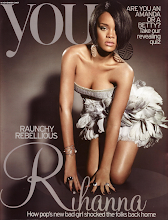
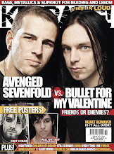
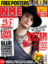
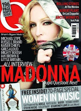
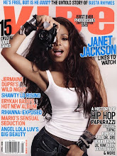
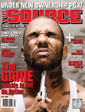
I have researched different double page spreads of real music magazines of a similar sub genre to the one I will use for my magazine, to give me an idea of what type of house styles, layouts, sell-lines, articles and images are used. I really like the layout of the first magazine as it is simple and modern looking, using a plain white background and black writing in contrast. I like the font style of the title and how it is big and bold, to make it stand out. There is a short introductory paragraph of the article below, in bold writing, which I think works well as it gives the reader an insight of what the article will be about. I will therefore use a similar layout for the double page spread of my magazine. Although I like the image next to the article as it is edgy and unique and also contemporary looking, I will use smaller images on my double page spread, but in a similar way. I like the way the second magazine is set out like an interview, in 3 columns, with questions in bold writing to stand out, and answers below. I also like the sell-line in the middle of the text as it makes the page look more exciting and will appeal to reader’s, making them want to read the article. I will create my article in a similar sort of way, as I think this works well. I like the layout of the next magazine, with a large image of a band on one side of the page and the article on the next, as I think this looks effective and states the importance of the band. The bold title and sell-line are eye catching and striking, which encourages me to create the double page spread of my magazine in a similar style.
No comments:
Post a Comment