


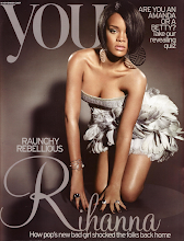
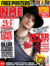
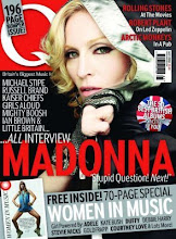
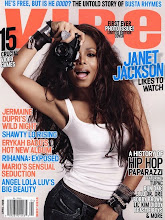
To give me ideas of the generic elements used in contents pages of real music magazines, I researched several different magazines. I found a variety, which were all different from each other in the types of Mastheads, house styles, font styles and layouts used. I chose these 3 contents pages from the magazines Q and NME, which are both mainstream so could be used for my magazine. They all have similar layouts, which each look eye catching and exciting, yet reader friendly. I like the simplicity of the middle and right hand side magazines as they are easy to follow in the way they are set out with bold headings, sell- lines, page numbers and separate columns. They each have a large image of a band or artist, with a short preview article below, which is there to grab the reader’s attention and make them want to read on. I will set out my contents page in a similar way as I think this works well and would be successful for my magazine. I like the bright colours of the left hand side magazine as they are vibrant and feminine, which is ideal for my target audience and fits the Pop/Dance sub genre that my magazine will be based around. I will therefore use similar colours for my contents page.

No comments:
Post a Comment