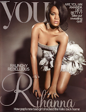
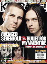
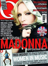
The Title of the magazine is Kerrang! which has connotations of an e chord on a guitar, relating to the heavy metal genre of the magazine. It also has an exclamation mark at the end to symbolise the statement it is making as heavy metal is a bold genre with a niche audience and also to connote a loud sound, as heavy metal is often listened to at a high volume. Kerrang! magazines are for teenagers who like heavy metal music, and are usually aimed at males, however this particular Kerrang! magazine inverts this by challenging stereotypical females, in having an attractive woman as the main image and using pink as the main theme of colour, as this is considered to be a girly colour and you wouldn’t expect females to be interested in heavy metal music.
The main image, presenting the cover story, is of a woman, which not only inverts the stereotypical male artists and male audience, by appealing to girls who would consider this woman to be an ideal self but also attracts males as they see her to be an ideal partner. The woman is blonde, which is stereotypical for models and is attractive and appears stylish, whilst wearing a leather jacket. This relates to characteristics of heavy metal band members and fans and appeals to teenagers as they can aspire to her.
Her facial expression shows a direct gaze looking straight at the reader to grab their attention. However she is wearing sunglasses to minimize what we can see of her, which makes her appear to be mysterious. Her expression also looks seductive, along with her body language, in which she is opening her jacket, revealing her bra. This makes her character seem sexy and promiscuous, appealing to male teenagers.
Underneath this image are phrases with various typefaces to show a difference in importance of the text, whilst looking attractive and following the house style of the magazine. ‘I’m not a bitch…’ is written in pink lowercase letters to show a softer side to this woman, which challenges the stereotypical view of heavy metal band members as being ‘bitches’. Below follows ‘ARCH ENEMY’ is capital white bold letters, to stand out and reinforce the characteristics of a band member as being rebellious and defiant, which appeals to teenagers as they are seen as rebellious, and so can relate to her. Underneath this writes ‘CONFESSIONS OF A METAL GODDESS’ in pink capitals to stand out, whilst tying in with the house style. This appeals to the readers as it is personal, making them feel as if they are a friend of hers and she is sharing her secrets with them. Also ‘metal goddess’ makes her seem the goddess of heavy metal music, exaggerating her importance, which causes readers to aspire to her.
In the top left corner there is an image of an artist playing live, within a white border, which is part of the house style. This has been done to show him in action, as if we are there watching him, which intrigues his fans and also draws in other people who are perhaps curious by him. There is bold pink text in capitals to stand out, saying ‘HIM’ which makes him seem important and superior, as if everyone knows who he is. Underneath there is black, smaller text in capitals saying ’24 HOUR IN LONDON WITH VILLE’ to inform readers what will be written about him inside and to also signify a wild sort of partying character as it seems like he is performing ’24 hours’.
At the bottom of the page is 2 images, both in white borders to again continue the house style, with a bold heading of ‘FREE POSTERS’ in white, highlighted in bright pink, to make it stand out, as it is advertising an offer that something is ‘free’, which appeals to readers. The images shows the ‘Foo Fighters’ and ‘Serj Tankian’ which have been chosen to appeal to their fans. Below is a white text in a pink highlighted band, to reiterate the house style. It is slightly diagonal, to give a quirky look, fitting in with the style of magazine. ‘PLUS!’ is written to exaggerate that there is even more inside the magazine, followed by a list of artists names, which is there to show the readers what will be inside but also to appeal to fans who perhaps don’t like the look of the main image or other bands, however would buy the magazine because their favourite artists are inside.
At the top of the magazine shows a similar list of artists, such as ‘Paramore’, to appeal to their fans and make them want to buy the magazine. Each different artists name has a pink star separating them to make it look attractive and fun. The overall mode of address used in this magazine cover is peer to peer, with phrases such as ’24 hours in London with Ville’ and ‘confessions of a metal goddess’ creating a personal friendship with the readers as they feel part of the action, making them want to read on.