1. In what ways does your product use, develop or challenge forms and conventions of real media products?
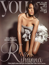
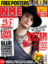
For my media product, which is a music magazine, I have researched various other real magazines, looking at the different forms and conventions that are used to make it appeal to its target audience. From this research I found that the typical generic elements of a music magazine are a masthead, a lead, sell lines, banners, drop capitals, strap-lines, by-lines, fonts, house style and a mode of address. These all contribute in helping sell the magazine. I therefore used these generic elements in my magazine, to make it look realistic and professional. I was influenced mainly by Blender as I used a similar house style, as it is feminine so appeals to my target audience, and also used similar font sizes and styles as I think they worked well. I also looked at Mixmag, as this is a dance/pop magazine, which is the sub genre for mine. I imitated the masthead used on Mixmag, using a similar font and style. I have kept my magazine A4 size, as this is the general size used for most other music magazines I looked at. I looked at NME as I know this is a successful and popular magazine, and was inspired by the types of banners and articles used. Consequently, I used a similar banner on the front cover of my magazine, and also a similar layout for my double page spread, with images on the left hand side of the page and an article and interview on the next, with pull quotes in between.
2. How does your media product represent particular social groups?
My music magazine has a dance/pop sub genre, and is aimed at females aged between 14 and 25. The mise en scene of my magazine signifies my target audience as I have used feminine colours and type of house style which will appeal to them. I have also used images which will portray an ideal self, for girls. Some of these images are stereotypical as they show women in a glamorous way, which we often consider women to be. However the double page spread images are less stereotypical as they show a girl looking ambitious and talented, letting herself go and belting out on the microphone, which we wouldn’t normally associate with females. Representations of generic elements found on music magazines give connotations and meanings which help signify the magazine from others and grab the reader’s attention, making them want to buy the product. My images and articles used represent women artists positively in a fun and ambitious way, which will appeal to teenage girls and young women.
3. What kind of media institution might distribute your media product and why?
I would expect my magazine to be distributed by a large company such as IPC Media or Bauer. I would expect the circulation figure for my music magazine would be quite small in comparison with the readership, due to my target audience. I have aimed my magazine at teenagers and young people, who tend to pass magazines onto their friends, as they don’t usually have a lot of money themselves. This means that although I think the readership for my magazine will be high, the circulation will be quite low, as not as many teenagers will buy it as they will read it.
4. Who would be the audience for your media product?
Looking at the NME reader profile, there are some comparisons to my music magazine, which helps me understand who would be the typical reader of my magazine. The average age of people reading NME is 24, which would fit my target audience and the circulation figure of 56, 284 is much lower than the total readership of 369, 000. This reflects the target audience of the magazine and tells me that my magazine would have similar sort of figures. The reader profile also shows that 96% of the readers use the internet also the majority care about the appearance. I think an imaginary reader of my magazine would be a teenage girl around 17 years old as my magazine is very feminine. She would be working class- middle class and most probably be white, as the majority of the artists I include and people in my images are white. They would be quite sociable and outgoing, with interests including music, clubbing, dancing and generally going out with their friends.
5. How did you attract/address your audience?
I have used various elements in the front cover, contents page and double page spread of my music magazine to attract and address my target audience. This includes a feminine house style of purple, white and black colours and articles such as ‘Pop princesses stick together’ and ‘Queen of pop’ which will interest young girls. I have used an image of a glamorous girl, appearing to be having fun, on the front cover, which will act as an ideal self to girls as they can aspire to her. In the double page spread I have used 3 images of a girl with a microphone to symbolise music, which is appropriate for this style of magazine and it will also appeal to my audience. My text incorporates recognisable elements from Mixmag magazine, such as a similar masthead and use of fonts and house style. I have used a peer to peer mode of address, to suit my target audience which is teenagers and young adults. I have done this by using chatty text in my front cover, contents and double page spread, for example ‘party with’ and ‘hot new tracks’ which you would imagine friends saying to each other. This helps attract my audience as they feel more involved and part of the action. I have also used nicknames for some of the artists for a similar effect, such as ‘Britney’ which allows the audience to relate to her, as if they know her themselves.
6. What have you learnt about technologies from the process of constructing this media product?
During the process of constructing my media product, I learnt many new skills and about technologies. For the making of my front cover I learnt how to use Photoshop elements 5, which has allowed me to produce a masthead, make a banner, and use different types of text and font styles. I also learnt how to use photographic manipulation in enhancing and editing my photos, then crop and cut them out, to re arrange them where I wanted on the page. I have used the following tools to do so:
· Magnetic Lasso Tool
· Crop Tool
· Paint Bucket Tool
· Horizontal Type Tool
· Eraser Tool
· Rectangular Marquee Tool
· Move Tool
· Brush Tool
· Enhance- Adjust lighting, Brightness and contrast
There were many strengths in using Photoshop elements, as it allowed me to create the layout I wanted, and edit my images and text; however its weakness was the cutting out stage of the images. I found it difficult at times using the Magnetic Lasso Tool, as it is free-hand and so required a lot of time and patience.
For the contents and double page spread of my magazine, I learnt how to use quark express. From this I was able to produce columns for my text, articles and interviews and import images. It allowed me to use various font styles and colours and also produce the layout I wanted. However Quark doesn’t have any cropping, enhancing, or brush tools, and so prevents you from making a masthead or editing images, which made it difficult.
Through the process of using a blog, I have learnt how to upload new posts, edit and customise them, and keep a schedule of my work whilst doing so. Although there were some problems with uploading some of the images and drafts that were produced on Photoshop and Quark, however I overcame this by going to File > Export > Layout as PDF then saving it in my Z:Drive as a pdf image in Quark. I then uploaded the image onto Photoshop and saved it as a psd document. For Photoshop, I saved my file as a GIF image, which allowed me to upload it onto my blog.
During the photography stage of my media product, I was taught how to correctly use a digital SLR camera, with lighting and a backdrop, which enabled me to produce professional looking photo’s to use on the front cover, contents page and double page spread of my magazine.
You
Kerrang!
NME
Rolling stones
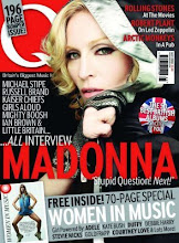
Q
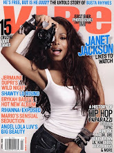
Vibe
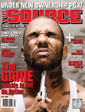
The Source
No comments:
Post a Comment